
Art for Writers Part II
Infodesign, Typography, Dos and Don'ts, and The Digital Straitjacket

Introduction
Last time, we introduced why you, as a writer, should care about art. Next, we developed a step-by-step method for developing your personal aesthetic, the first and widest level of the Great Pyramid of Art.
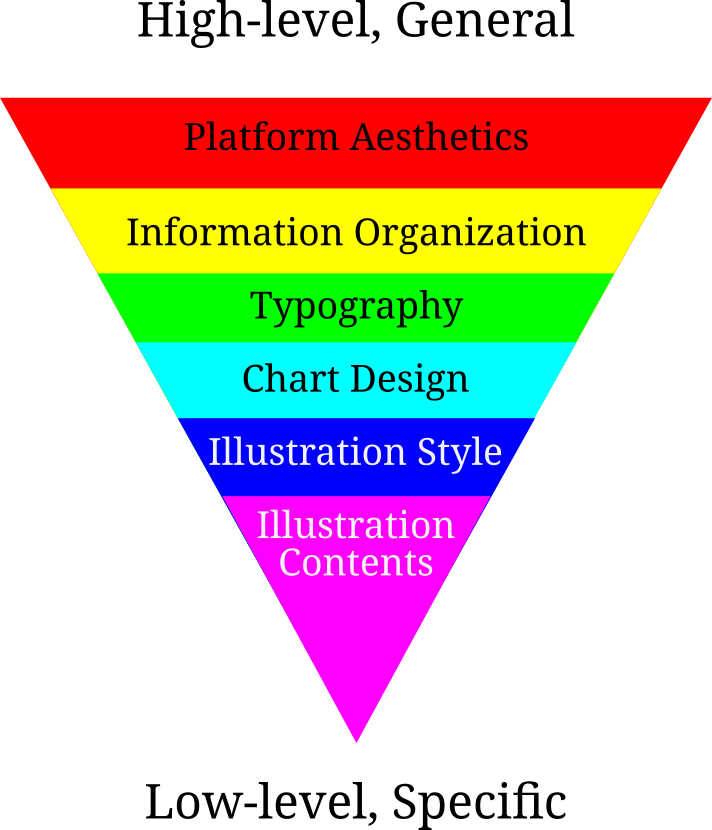
Now we’ll descend the next few steps, starting with…
Information Organization
Think of how information flows through your website.
You’ve already done this within each post. You know that it’s important to keep a fluid and entertaining organization: this includes hooking your reader from the beginning, building the sections on top of each other, cutting out needless words and sections, and more. I want you to do that with your whole website.
What order do you want the reader to encounter your work? Especially for new readers, this is a huge factor in how your work is received and how your readers are converted into longtime readers. You should have something easy to digest for newcomers. The entire oeuvre of each individual writer is a foreign land unto itself, with its own habits and particularities. Just like with any other kind of travel, you want to be a good host and provide your reader with a tour guide. A “best posts” or “read first” list is excellent for this. You also want something for old fogies: the “new posts” list.
Most blogging platforms default to reverse chronological order. This helps frequent readers best. Is it the only way? I’ve often learned a lot by seeing someone’s development by reading their posts in chronological order. If your posts build on each other, as mine often do, they should be indexed as such.
For webcomics, the standard is to have three buttons: one for the first post, one for the last post, and one for a random post. What if you did this with your own blog? That would serve many different types of readers.
Interim 1: Medium, Substack, and the Digital Straitjacket
Welcome to our first interim! These will be interesting skippable asides, not about ascending the pyramid so much as descending design rabbit holes.
When it comes to visual design, “literary” social medias like Medium and Substack are awful. Since these websites are so powerful, sterile design is a mark of modern literary culture. To understand how we got here, we need to talk about the transition from web 1.0 to web 2.0.
During the mid to late 90s, if you wanted to post something on the web, your only option was to buy a domain and build your own website. Most internet users were passive consumers of content created by a tiny minority. We retroactively call this state of affairs web 1.0.
On the one hand, this limited the interconnected nature of the web, since the majority of users were just passive consumers. On the other hand, since every creator set up their own digital homesteads, they had immense freedom to design them as they wished. The technical limits of CSS and HTML were the only limits. As these languages developed, those limits widened. You can see this if you compare the development of various websites with the Web Design Museum from 1995 to 2003. Designs became stronger, more creative, and more diverse.
Then came web 2.0. Web 2.0 wants the vast majority of web users, the consumers, to become co-creators by commenting, replying, liking, and reposting. Its ambition is to make the internet a true social network. At first, it wasn’t necessarily clear how these would work: some wanted to draw lines between multiple websites in a decentralized network, with likes, dislikes, and comments in a decentralized ledger. It would be Usenet for the web. Webrings are an early implementation of this idea.
Unfortunately, chaining together multiple idiosyncratic websites, each with no standard design, proved unworkable. Developers preferred concept of in-website networks: users would all post and consume content on a single website. This is the standard model of social media that we know today, pioneered by classmates.com, MySpace, and Facebook. These websites need to store and shuffle around huge buckets of data, which was the impetus for the development of cloud computing.
We now arrive at the social media phenomenon. In web 2.0, we don’t post our creations on our own sites, but the sites of others. It’s not all bad: when we assimilate into the network, it’s easier for us to discover other people and for them to discover us, and for non-technical users the experience is smoothened greatly. One of the costs is that, if you host your blog on a web 2.0 site, most of your aesthetic choices have been made for you.
This is why, if you’re on Substack or Medium, it’s hard to follow a lot of my advice. There’s a reason all Substack sites look kind of similar: Substack has identified a certain aesthetic for itself that it wants to adhere to; and it wants you to adhere to it, too. They bind you in an aesthetic straitjacket to achieve this aim.
A trade-off often reappears: ease and popularity against freedom and individuality. We see this not just in blogging but in all software. But that’s a topic for another post.
Typography
Text art is called typography. The look of the text has three dimensions: font, size, and color.
You’ll find color easy because you already chose it in your color scheme. There are a few complicated matters— for example, link colors. Your default link color can be anything you want as long as it fits the color scheme. The clicked link color should be darker than normal link color and the hover link color should be brighter.
The size of your text can be varied for emphasis and distinction, as I do in this article. I like to have predefined sizes for headings, subheadings, subsubheadings, on and on unto the seventh generation. Multiple people have chastised me for my recursion obsession.
Like with color, you should stick to a size scheme. As with everything, this should be a deliberate choice. Don’t mindlessly choose the default option if you have the choice (grrr, Substack!). Your size scheme doesn’t have to use regular scaling intervals.
Finally we come to the big one: font. Your biggest decision will be serif vs. sans-serif; you should choose this first and then choose a more specific font from there. Keep your fonts readable, you want to choose a font that your reader will enjoy reading thousands of words in.
Most importantly, read Butterick’s Practical Typography.
Patterns and Antipatterns
There are a few websites I uphold as examples to follow (patterns) or to avoid (antipatterns).
Patterns
Gwern.net
Encountering this website was one of the joys and privileges of my life.
In any dimension you can name, Gwern’s website excels. Color scheme? Gwern keeps it simple with austere black and white throughout, creating a mysterious, academic mood. Information flow? Right at the beginning, not only do you have a “Newest” column and a “Popular” column, but each page is meticulously organized into a category so the user can find what interests them. Decorations are borrowed from 19th century typography yet their design adds a modern flair.
It’s a masterpiece. Study not only the website, but Gwern’s description thereof .
Betaveros
Another banger, this time for different reasons. Once again we have a very strong color scheme that’s reinforced by everything from the background to the link color. Notice how the background isn’t solid red but instead a repeating pattern of pixels. Because the background was randomly generated (and because the range of values is tastefully restricted), we don’t notice that the background is repeating. Further, the pixels call to mind both computer science (betaveros’ profession) and the rows of a puzzle begging to be filled in (his eminent hobby).
William Friedman, Tragedy of the Titanium Tyrant
https://palacefiction.substack.com/
Having a strong aesthetic on Substack isn’t easy. That’s why it’s so impressive that Friedman has one. He presents us with a different coat of arms in each post thumbnail, giving the posts a coherent identity — I could recognize the Titanium Tyrant with my eyes crossed.
Antipatterns
Astral Codex Ten
https://www.astralcodexten.com/
I’m gonna get flamed for this, but it needs to be said.
Scott Alexander is good at many things, but blog design isn’t one of them. There’s very little that sets this blog apart. The thumbnails are either stock images or AI-generated, and they don’t even have a coherent style. I see no visual throughline that connets everything. The bare blue background is just that… bare, boring. There’s nothing that it looks like to be a Scott Alexander article.
Much of this is Substack’s fault, not Scott’s, but as we saw with Friedman, there are ways to get around Substack’s restrictions and Alexander just doesn’t make the effort. To be fair, Alexander’s textbook logo is strong, but it’s so small on Substack that the effect is wasted.
David J. Peterson’s Conlang Archive
As the author of Dothraki and Na’vi, Peterson is the second best artlanger alive.1 If only his web design skills were as good!
Where Alexander is too quiet, Peterson is too loud. Amusingly, he gives you the option of viewing his website in many different color schemes, all of them terrible. His schemes are so bad that they’re excellent studies in what not to do. In Inverse Simplex links are hard to read, KNSL makes my eyes hurt, X reminds me of edgy tween girls, and I fear I will summon a demon if I attempt to describe Kalenala.
David R MacIver
https://notebook.drmaciver.com/
Man, I’m really picking on Davids today, aren’t I?
Unlike the other two, this website has nothing seriously wrong with it. It is inoffensive. Another word for “inoffensive” is “cowardly.” By the time I’ve left the website I’ve already forgotten it. Don’t be boring! Making your identity involves making choices, and those choices need to make your blog memorable. In blogging as in life, worrying too much about someone disliking you leads to no one liking you.
Conclusion
Next time, we’ll continue descending the pyramid.
The best is, of course, Mark Rosenfelder