
Art for Writers Part III
Graphs, Illustrations, and Art Made and Generated

This is the final part of the adaptation of my Inkhaven talk Art for Writers.
Previous parts:
Last time we stepped down two levels of the Great Pyramid of Art, and now we will descend until we reach its base.
Chart Design
“Chart” is an umbrella term for all methods of data visualization, from line graphs to heat maps, histograms, and more.
The chart is one of the greatest tools of nonfiction writing. It is the primary factor of the superiority of the written word to video and radio for nonfiction. Only in writing can you publish large, complicated charts that the reader can pause and take a good long gander at. Such a chart can greatly enhance your argument.
Charts are especially vital for empirical, analytic nonfiction. Rationalists, as inheritors of the positivist tradition, take this for their daily bread. Basically, if you hope to support your argument with a strong standard of evidence, you’ll need one or more graphs.
The three most important aspects of a chart are clarity, clarity, and clarity. Make sure you’re using the right type of graph for the right type of data. Don’t make the text too small. Title your graph and both axes.
Secondly, don’t lie with data. The data should look like what it is. Make sure that when a user makes a visual comparison, the comparison that they readily see matches the data. This article has many good examples of what not to do.
Once you’ve got down these basics, read Edward Tufte’s Envisioning Information, the incredible classic on this field. Tufte is great at drawing effective and creative charts from obscure historical nooks and crannies.
Factoring in all of the above, I encourage you to be creative with your charts. Having them use a certain font or color scheme that is all your own is useful. This is something I need to improve at.
Interlude 2: CSS is awesome, Actually
Programmers have a superpower when it comes to creating the visual experience of their work. It’s called CSS.
CSS (Cascading Style Sheets) is the declarative language used since the days of Web 1.0 to style websites. In most websites it defines backgrounds, the attributes of the text, and the look and feel of all possible elements of the website. More broadly, it controls all aspects of the spatial structure of the website beyond the skeleton given to it by HTML.
Yet it can do even more than all this.
A canonical reference is the CSS Zen Garden. While this website has dozens of URLs, in some sense it only has one page, since all URLs use the same HTML. They differ only in their CSS files. This lets the viewer understand all that can be achieved with CSS alone, from an an Egyptian-style page to an animated steel foundry. The CSS for each page is available for reference.
CSS is a powerful animation language, as we see in CSS Zen Garden’s Steel page and in the intro to Slowchat by Emma Essex. It is a seriously underestimated tool.
Unfortunately, because CSS is so often underestimated, there aren’t as many resources to help you learn it as other languages. There is no substitute for trial and error, but CSSTricks remains the best place to start. This course from web.dev is also good.
Overall, I recommend doing less with Javascript (JS) and more with CSS. JS is so syntactically awful that just using it feels dirty, in addition to opening up dozens of security holes. Finally, sticking to CSS automatically makes your website more portable.
Illustration + Art
Illustrations are specific images added to an article or website to make it more interesting. They need not be embedded in the single column format of an article, as is so common today. It used to be more common for them to be in the page background, like on the Garments page of CSS Zen Garden. We should bring this kind of thing back.
To AI or not to AI?
A lot of people, such as Scott Alexander, use AI to illustrate their posts or generate thumbnails. Let’s take a look at the pros and cons of using AI in this way.
AI Pros
1. AI is cheap and fast. This isn’t nothing! At its best, AI art occupies the same niche as clip art of the 1990s but does so in a strictly better way.
2. AI is highly customizeable; you can have it portray nearly everything non-offensive.
3. AI is often surprisingly good at the general composition of the piece. The piece will usually look good zoomed out.
4. Further, AI is good at having an intuitive grasp of mood, like using certain colors for certain subjects and situations. For example, here are the results when I asked ChatGPT to “Make a painting of a demon” and “Make a painting of an angel.”
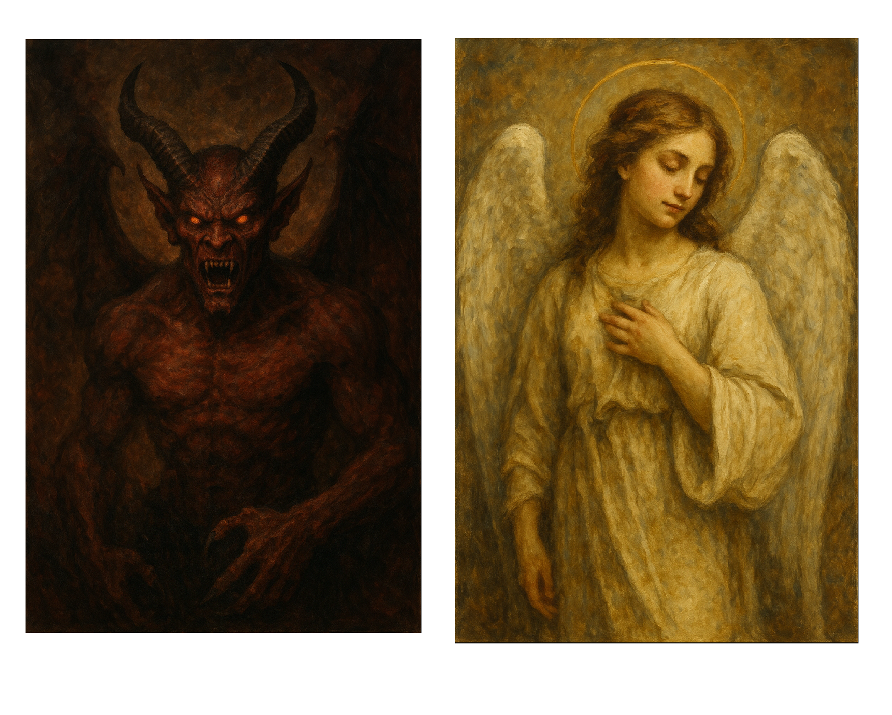
Angel and Demon
Note the color scheme on the two paintings: the devil painting automatically uses much darker colors, black and red, whereas the angel uses white and yellow, representing good. The AI is very good at capturing the respective moods that these two paintings should convey simply by the subjects they capture.
5. Finally, AI is very good at imitating style, especially when that style relies on color rather than line. This is why I asked ChatGPT for paintings rather than drawings.
AI Cons
1. People HATE it
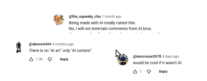
AI haters in their natural habitat
You’re probably underestimating how much the average person detests AI. Whether it’s due to perceived lack of quality, ethical issues with copyright and crowding out human artists, or something else, people will think less of you if you include AI art in your work. Whether you think this is fair or not, it is the reality.
AI struggles to get minor details right: note the misaligned halo on the angel. Further, when zoomed in the details will often look “goopy”, for example there might be extra fingers or arms for background characters. I liken the style of AI illustration to a plasticine model that has been slightly melted in the sun.
AI Art looks kind of similar. Many people have noticed a slightly yellow “piss filter” that washes over AI art. This makes it harder to establish your aesthetic.
AI art may look too perfect or too generic. Once again, this makes it harder to establish your own personal aesthetic with AI. Whether you can overcome this is anyone’s business.
It’s lazy. If you only spent three seconds to make an illustration, don’t expect people to spend more than three seconds looking at it.
Should you use AI? I can only give you my opinion. Would you copy-paste an AI-generated paragraph into your own writing? No? Then don’t do that with an AI-generated image! Your words and your visuals are not separate.
Intro to Illustration
Instead of AI generation or stock art, I think writers should illustrate their own posts. You can probably tell this is my opinion since it’s what I do for the thumbnails on all my posts. I think, for most people, this is more accessible than they think.
“But I can’t draw!” I hear you say.
Sure, you might not be able to do this…
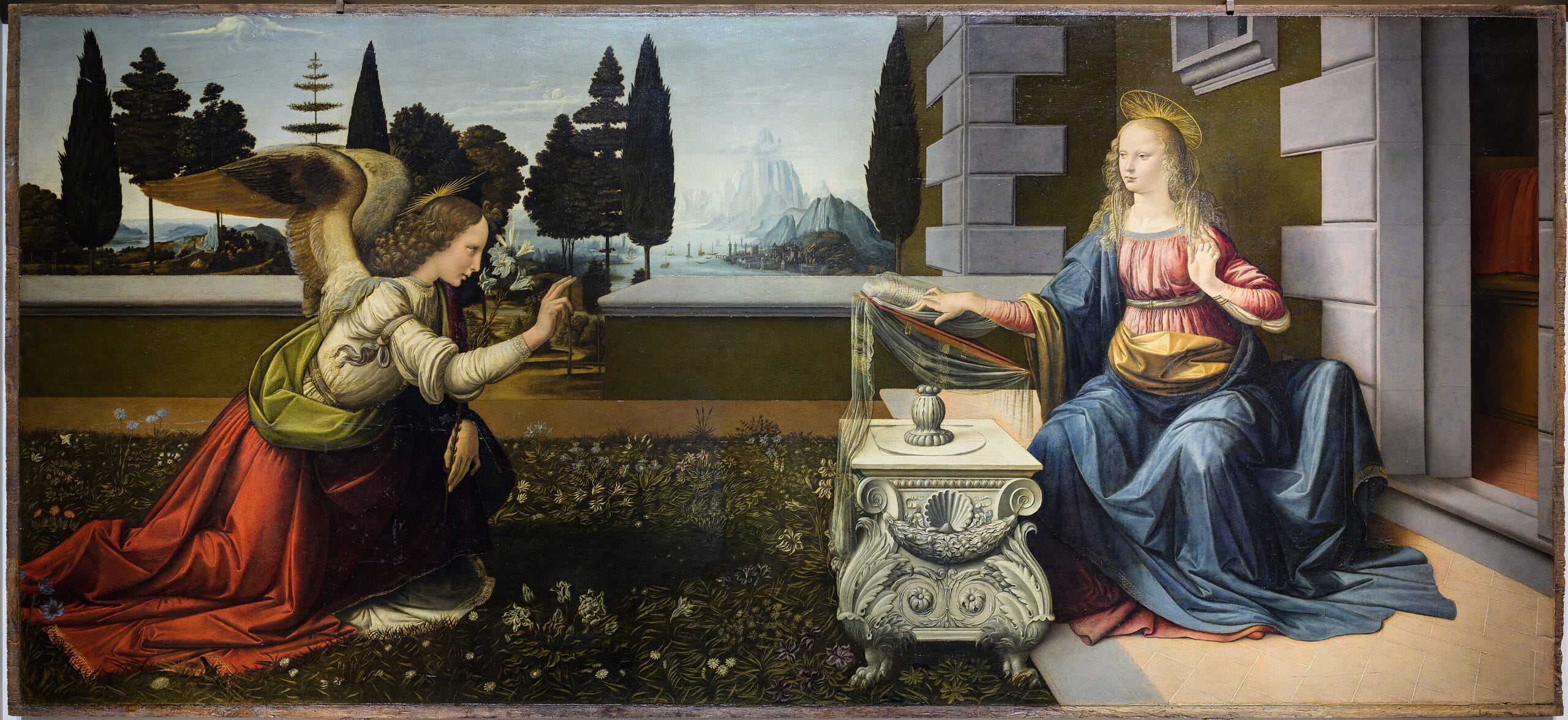
Leonardo da Vinci’s Annunciation
… but can you do this?
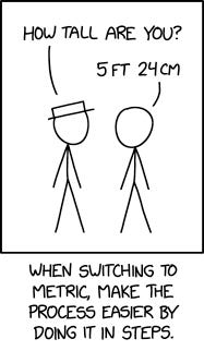
XKCD 3164
… or even this?
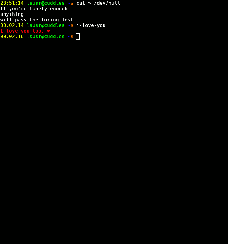
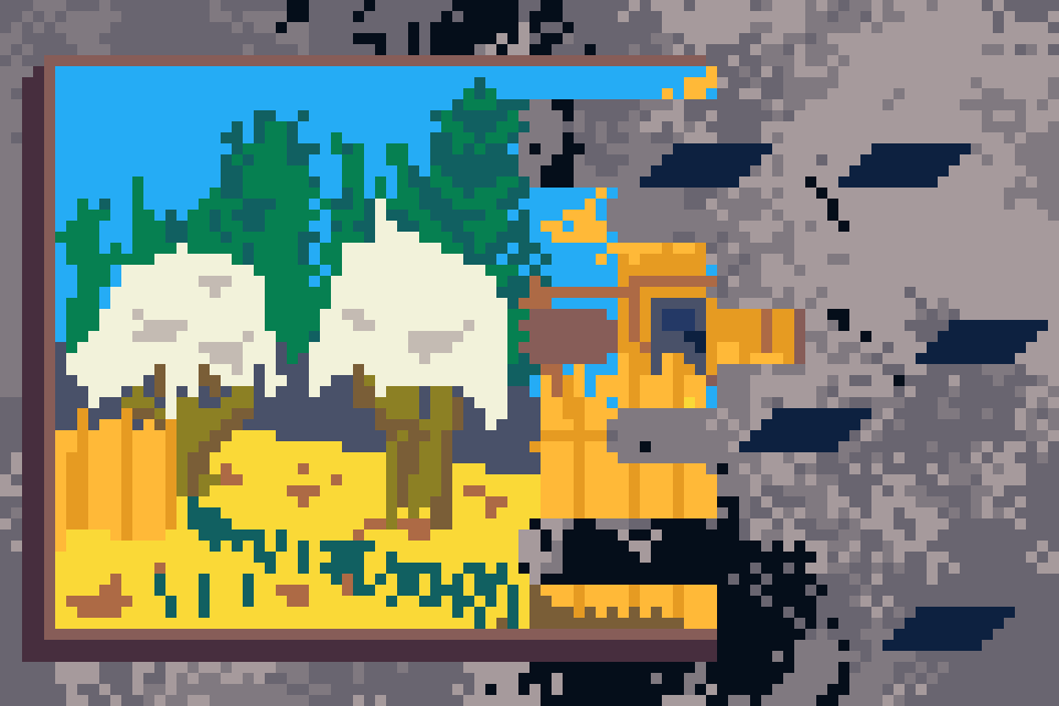
Lsusr, https://www.lsusr.com/2.html
If you try, I guarantee that you can produce interesting original illustrations for your work.
Learning to Illustrate
In art as in everything, the major steps to learning are practice, practice, and practice. For an hour a day, draw what you want to illustrate your own posts. If done consistently, this habit will bring you better returns than any other resource.
This being said, while practice shall be the engine of your artistic advancement, a good course can provide useful railroad tracks.
Drawabox is the best free art course on the internet. It brings you through the fundamentals of art with the construction method. It focuses on strong line technique and step-by-step construction of forms in 3D space; if you master these you’ll be able to draw everything with great ease, and the speed at which your practice generates returns will increase. Importantly, Drawabox has a large community of people willing to give feedback on your work, so you won’t be alone in your journey.
Illustration Tools
If you want to use traditional art, make sure that you’re scanning your work to digitize it rather than photographing it. Pictures of art usually lead to poor results, unless your camera setup is amazing.
When it comes to digital art the field is divide in two: on one side you have raster art, which is stored as a set of pixel values, and on the other you have vector art, which is stored as vectors.
In general, for illustration work you’ll want to use raster tools, since these are the most flexible. However, for diagrams, you may want to use vector art, since diagrams and flat design styles don’t need a ton of details. Further, vector art has the advantage that it can be scaled infinitely, whereas if you zoom in on a raster image too much you’ll see the pixels and it will start to look horrible.
I prefer free or very cheap art programs. My “daily driver” art program is Krita, which is raster-based and is focused on painting and line art. For vector art, I use Inkscape, for pixel art I use the fantastic Aseprite, and for general photo editing I use Gimp.
Generally, when it comes to art, the tools don’t matter so much as the creator. What you want is to choose a tool and master it. The tool you choose doesn’t matter so much.
Conclusion
Art is good and you can learn it. Go forth and create!